
How to coordinate wedding stationery and table details
One drawing, one colour, one style of lettering: how to make the pieces on the table belong together.
Choose three things to carry through
Start with three decisions: one main colour, one style of lettering and one drawing or motif. Together they make a short brief for every piece guests see on the day, and they help when your florist, planner and stationer are each working on a different part.
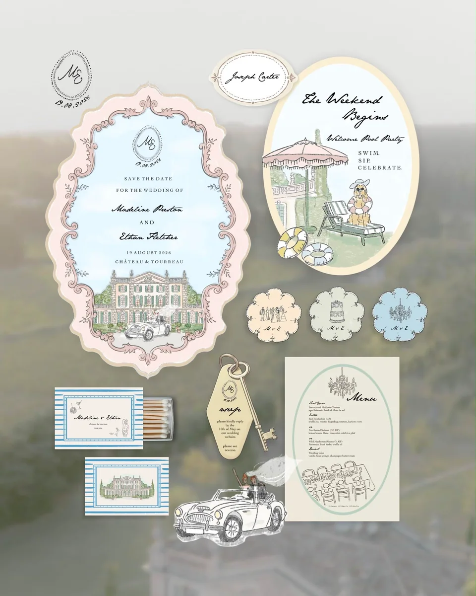
The venue drawing might appear in full on the invitation and as a small doorway on the matchbox. A border might return on the menu while the place card takes only its colour. The pieces feel related without repeating the same layout everywhere.

Let each piece do its job
An invitation needs space for information. A menu has to be readable at the table. A place card should make the guest’s name easy to find. A matchbox can hold the more personal detail, initials or a short line that would feel out of place on formal stationery.
Before choosing finishes, list the pieces you actually need and where each will sit. Ask your planner about table sizes and whether menus are shared or one per guest, so pieces do not compete for the same small space.
One drawing on matchboxes, napkins and coasters
Napkins and coasters can be made in the same drawing as the matchboxes. A drawing by the studio is one fee of £100, whatever the subject.
For matchboxes, most couples order about one per guest, often 100 to 150, with a few kept back for the table and the photographs.

Balance colour with the room
Look at the linen, flowers, glassware and lighting alongside the paper. Dark ink on a light paper keeps wording clear, and a coloured drawer on the matchbox (£2 a box, or £2.50 in your Pantone colour) adds a small accent when it is opened.
If several suppliers are involved, share the same approved references. The same colour can look different on paper, fabric and a screen, and a digital reference does not promise an exact physical match.
Approve the pieces together
Look at the proofs side by side before approving any of them. Check names, date formats, colours and repeated motifs, then each piece at its real size. Guest names for place cards often arrive later than the artwork, so agree when the final list will be sent.
When you ask about the Wedding Suite, include your guest count, the pieces you need, the venue, the date and the delivery address. Ask for the quantities, papers, finishes and timing of each piece in writing, so the brief and the order cover the same table.
Explore the Wedding Suite: see prices and order
Image references
The reference photographs in this note show real weddings, tables and rooms photographed by others. They are not work by The Laldie and are used under the Unsplash Licence.
- A table where napkins, runner and flowers share two or three colours. Photograph by Bruno Ngarukiye on Unsplash. Image: images.unsplash.com/photo-1758810743028-6b8e150ec98f
- Colour taken from the setting itself: linen, wood and fruit. Photograph by Bruno Ngarukiye on Unsplash. Image: images.unsplash.com/photo-1758810752154-7697dd5773e7