Letterpress leaves a gentle impression
Letterpress presses inked artwork into paper, leaving a tactile impression you can see and feel. It is especially beautiful for confident typography, monograms and simple line work where the depth becomes part of the composition.
The process favours restraint. Very fine details and large areas of solid colour may need to be adjusted, while generous paper and a limited palette allow the impression to take centre stage.
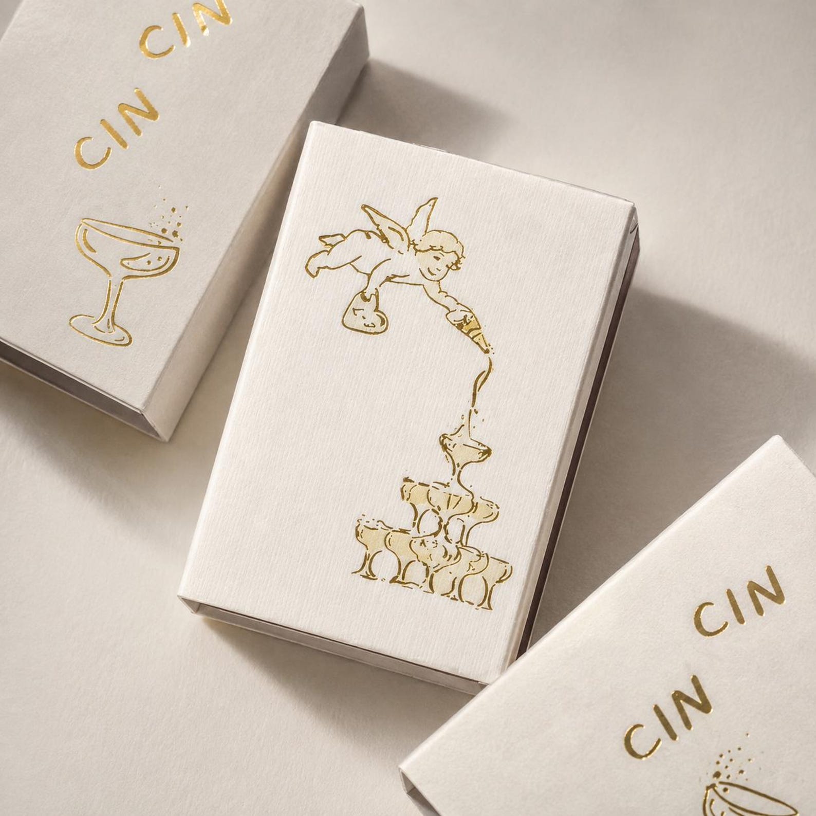
Foil catches the light
Foil adds a reflective layer rather than ink. Gold and silver are familiar choices, but softer champagne, copper or coloured foils can feel more personal. Candlelight and evening settings make foil particularly expressive.
Use it for one deliberate moment: a name, border, tiny star or architectural highlight. When everything shines, the eye has nowhere to rest.
Embossing and debossing speak through shadow
Embossing raises artwork above the surface; debossing presses it inward. Both can be used with colour or as a blind finish, where the shape is created entirely by light and shadow.
A blind monogram on warm white paper is almost whispered. A deeper deboss on a darker stock feels architectural. The choice depends on whether you want the finish to be discovered slowly or seen across the table.
Paper changes every finish
Cotton rich and lightly textured stocks hold an impression beautifully, while smoother papers keep fine printed lines crisp. Colour also matters: bright white feels clean and graphic; ivory softens a palette; deeper shades make metallic details glow.
Ask to consider paper, print method and artwork together. A finish should never be chosen from a list in isolation because the same gold foil can feel completely different on blush, burgundy or natural stock.
Choose a hierarchy of details
Begin with the information or image that matters most, then decide where touch or light could add meaning. You might use letterpress for the names, flat print for the venue drawing and a single foil line to connect the suite.
Specialist finishes require artwork and production review before they are confirmed. That pause is useful: it ensures the method suits the scale, quantity and material, and that the finished piece remains elegant rather than overworked.