
Begin with paper that has presence
The first impression of an invitation is physical. A generous stock feels composed in the hand and gives typography and illustration a proper surface on which to live. Smooth paper keeps fine line work crisp; a lightly textured sheet adds softness and depth. Neither is automatically more luxurious. The right choice is the one that supports the design.
Ask to see paper, colour and print method as one decision. Warm ivory can soften a formal suite, while a clean white stock gives hand drawn artwork a sharper, more contemporary character. Weight matters too: menus and place cards should feel substantial enough for the way they will be handled at the table.
Use special finishes with restraint
Foil, letterpress and embossing are most effective when they guide the eye to one meaningful detail. A small monogram in foil, a blind embossed border or names pressed into cotton rich paper can create a quiet moment of discovery without making the suite feel overworked.
The technique should earn its place. If the illustration is the heart of the design, let the material support it. If typography leads, give it enough space and choose a finish that rewards a closer look in daylight and candlelight.
Let every piece belong to the same world
A polished wedding suite does not require the same artwork on every object. Carry a few decisions through instead: one principal colour, a recognisable line quality, a border, a monogram or a particular way of setting the names. The invitation can be formal, while the matchbox or napkin holds the more playful detail.
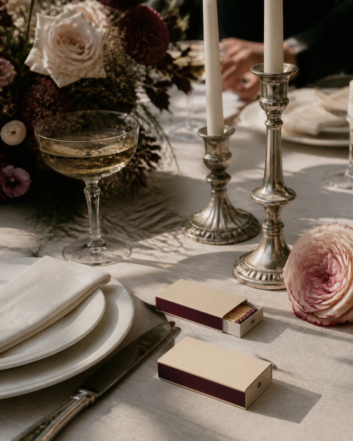
Menus, place cards, matchboxes, napkins and coasters should feel related when they meet on the table. Varying scale and placement keeps the collection alive; repeating the palette and drawing language keeps it coherent.
Spend attention where guests will touch
The pieces guests pick up often carry the strongest memory of the table. A menu that opens beautifully, a matchbox beside a candle or a coaster drawn for the venue turns stationery into part of the experience rather than a layer placed on top of it.
Choose fewer elements and make each one useful. A well made object has room to be noticed, used and taken home. That sense of purpose is what gives a wedding detail its lasting value.
Protect the quality with a clear proof
Before production, review names, dates, colour, scale and spacing together. Look at the proof at approximately finished size and check how the pieces relate as a group. Beautiful materials cannot rescue crowded wording or an unresolved hierarchy.
Share your guest count, venue, destination and date early. A clear schedule leaves time for considered revisions, production and delivery, so the final suite arrives feeling effortless rather than rushed.